Fix Mobile Website Experience - Security-First Mobile-First
Security-First Mobile-First. Battle-Ready Performance. See the Ecosystem.
Great on desktop, broken on mobile? Highlander delivers a security-first, perfect mobile experience from day one. Stop losing traffic.
The Mobile Experience Disaster
Your site looks great on your desktop. Professional. Clean. Fast. You're proud of it.
Then you check it on your phone. Tiny text. Buttons too small to tap. Images overlapping. Slow loading. Navigation broken. It's a disaster.
Analytics show 65% bounce rate on mobile. Traffic is coming, but mobile users leave immediately. You're losing 60%+ of potential customers.
The Stakes Are Higher Than You Think
60%+ of web traffic is mobile. Google uses mobile-first indexing—your mobile site quality affects your ENTIRE site's rankings.
Bad mobile experience = lost traffic, lost rankings, lost revenue. You're not just losing mobile users—you're damaging your entire SEO.
The Mobile Reality
If your mobile experience is bad, you're losing the majority of your audience and tanking your SEO.
Desktop-First vs Mobile-First
| Factor | Desktop-First (Typical) | Mobile-First (Highlander) |
|---|---|---|
| Mobile Performance | Sluggish | Blazing Fast |
| Mobile Bounce Rate | 60-70% | 25-35% |
| Touch Targets | Too small | Finger-sized |
| Load Time (Mobile) | 5-8 seconds | Under 2 seconds |
| Layout on Narrow Screens | Broken/overlapping | Perfect |
| Google Mobile Ranking | Ranked Lower | Rewarded |
Stop Losing 60% of Your Traffic
Mobile-first architecture that delivers perfect experiences on every device.
Why Choose Our Web Development Services?
Mobile-First Architecture
Built for mobile from line one. Not 'made responsive' after the fact. True mobile-first design and development.
Fast on Every Device
Lightning fast on mobile (not just desktop). Most sites are sluggish on mobile. We deliver blazing speed consistently.
Touch-Optimized Interface
Buttons sized for fingers, not mouse pointers. Proper spacing, touch targets, swipe gestures—all considered.
Responsive Everything
Images, text, layouts, navigation—everything adapts perfectly to any screen size. iPhone to iPad to desktop.
Mobile-First Indexing Ready
Google indexes the mobile version first. If your mobile site is broken, your rankings suffer. We optimize for Google's mobile-first world.
Lightweight Pages
Mobile users are often on slower connections. Our pages load fast even on 3G/4G networks.
Results You Can Expect
Lower Bounce Rates
Stop losing 60%+ of mobile traffic. Perfect mobile experience keeps visitors engaged.
Better Mobile Rankings
Google's mobile-first indexing rewards great mobile experiences. We deliver what Google wants.
Reach Mobile Majority
60%+ of traffic is mobile. If your mobile site is broken, you're losing the majority of potential customers.
Mobile Conversions
Mobile users convert when the experience is good. Bad mobile UX = lost sales.
See What People Are Saying
Real Stories. Real Satisfaction
Built for Business Growth
From $2,999, transform your business website into a lead-generating machine.
- Proven ROI
Our business websites average 3x more leads with lightning fast performance
- Enterprise-Grade Security
Bank-level security with 99.9% uptime guarantee
- Built for Growth
Scalable solutions that grow with your business needs
- Full Service Support
From development to SEO, we handle everything
Trusted by Business Leaders
Professional Development Process
Your project deserves enterprise-grade tools and processes.
Project Management
Track every detail in Asana with real-time Slack updates. You're always in the loop.
Project Timeline
Discovery & Planning
Design & Architecture
Development & Testing
Enterprise Security
Enterprise-grade security for your peace of mind.
Quality Assurance
Multi-stage testing with Sentry production monitoring and UserSnap feedback tools.
Data-Driven Growth
Weekly tech blogs and SEO optimization based on Google Trends analytics.
Clear Communication
Daily Slack updates, weekly video calls, and a dedicated project dashboard keep you informed every step of the way.
Trusted Technologies
Industry-leading tools we use to deliver excellence.
Modern Deployment Pipeline
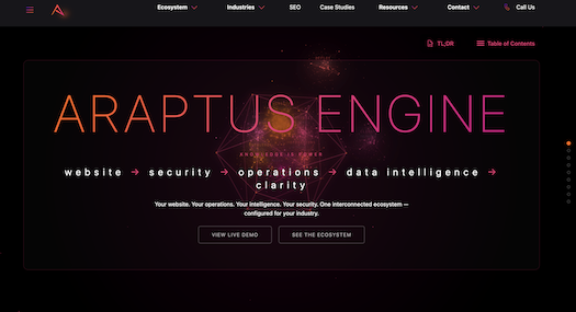
Araptus Highlander
Security-First. Production-Grade. Built to Last.
Security-First Infrastructure for Today's Internet
Why build from scratch when you can start with a production-grade foundation? Araptus Highlander gives you months of development work, hardened for the modern threat landscape, and ready to customize for your needs.
Enterprise Security
6-Minute Deployment
Managed Infrastructure
6-Minute Deployment
Production-ready in under 6 minutes
Enterprise Security
Production-grade protection built-in
Managed Ecosystem
Professionally managed infrastructure
Global Ready
15+ languages supported
Why Businesses Choose Highlander
- Security built into every layer
- 6-minute deployment, production-ready
- Security-first infrastructure
- Built to perform and built to last
Ready to Build Your Digital Empire?
Experience security-first infrastructure built for today's internet. Production-ready in under 6 minutes.
Frequently Asked Questions
Responsive doesn't mean good. Many 'responsive' sites just shrink desktop layouts—terrible UX, slow loading, tiny text, difficult navigation. Mobile-first means designed FOR mobile, not adapted FROM desktop.
Because most sites are built for desktop first, then 'made responsive.' Mobile gets bloated desktop resources, slow JavaScript, oversized images. We build mobile-first, so mobile performance is excellent from day one.
Google now indexes the mobile version of your site first. If your mobile site is broken/slow, your ENTIRE site (desktop included) ranks lower. Mobile performance directly impacts your search rankings.
Depends on the platform. WordPress/Wix sites are inherently slow on mobile. We can optimize, but you'll never hit Highlander speeds. Real solution: rebuild on mobile-first architecture.
Responsive design that adapts to any screen size. Testing on real devices (iPhone, Android, tablets). Vercel Edge Network delivers optimized content to each device type.
All considered. Touch-friendly buttons, swipe navigation where appropriate, no hover-dependent interactions. Designed for how people actually use phones.
Ready to Transform Your Business?
Join hundreds of successful businesses who've chosen Araptus for their web development needs.